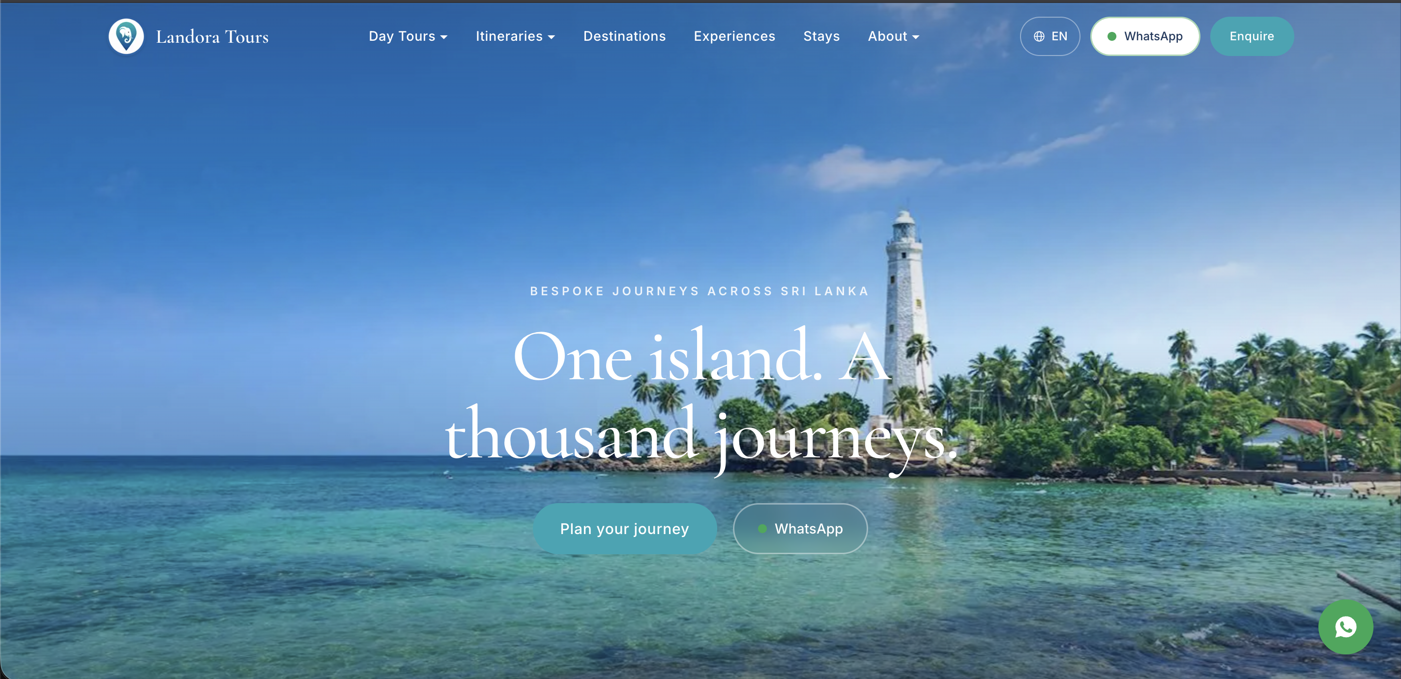
Landora Tours arrived with a list of packages and the hotels they work with. Everything else — what the site should be, how it should be organised, how it should look and how it should behave — was ours. We researched the market, designed the experience, and built it in Next.js: an interactive island map, and a step-by-step planner that lets a traveller assemble their own journey.
The brief was a list of packages
Landora came to us with what they knew: their tour packages, and the hotels they work with. There was no site, no structure, no brand direction, and no view on what the pages should even be. Everything from that point — what this thing is, how it is organised, how it looks, how it behaves — was ours to decide.
That is a larger brief than it sounds. A tour operator's website is not a brochure. It is the entire sales conversation with someone who will never meet you, in a country they have never visited, before they send you a significant amount of money.
We started by reading, not designing
Before any screens, we went and learned the business. Who actually travels to Sri Lanka and where they come from. What they book and how long they take to decide. What the island is known for, region by region. And how every other operator in this market presents themselves.
Four things came out of that, and they shaped everything after.
People planning a trip here research for weeks. They are not converting on a first visit. They open several operators in several tabs and come back repeatedly.
They are not buying an itinerary. They are buying confidence. That the trip will be good, that the company is real, and that a stranger on the other side of the world will actually reply. Nothing on a tour site matters more than looking like a company you can trust.
Most competitor sites lead with price and bury the country. Dense listings, cluttered layouts, everything shouting at once. Very few of them help a person actually picture the trip they would be taking.
Sri Lanka sells itself, if you let it. The photography does the persuading. Text is there to support it, not to compete with it.
So the design brief we wrote for ourselves was the opposite of the market: calm, unhurried, image-led, and deep enough that a stranger could learn the country before anyone mentioned a price.
Designing for someone eight thousand kilometres away
The result is quiet on purpose. Generous imagery, a lot of breathing room, one idea at a time, and a tone that reads as a knowledgeable local rather than a sales floor. The homepage opens on the island rather than on an offer.
Entry is by theme rather than by product name, because that is how people actually arrive — someone knows they want wildlife, or a honeymoon, or the hill country. They do not know that they want the Ceylon Highlands 9-Day. Eight themes run across the catalogue: heritage and culture, wellness, wildlife, nature and adventure, beaches, honeymoon, family, and luxury.
An island you can click
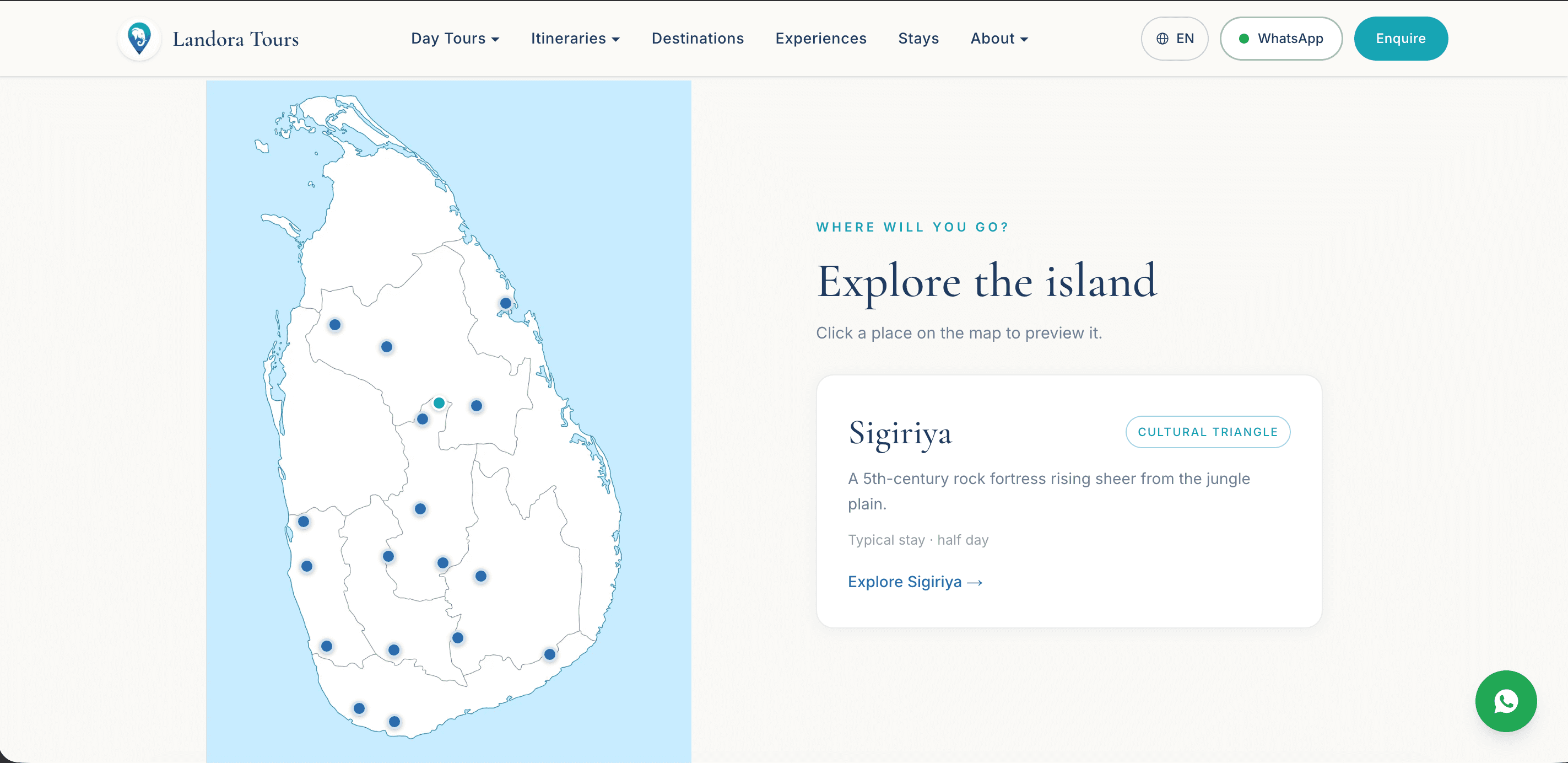
Most visitors cannot place Sigiriya on a map, and a list of place names does not help them. So destinations are browsable through an interactive map of Sri Lanka — click a point, see what is there and what it is near. Underneath it, the country is organised into six regions: the Cultural Triangle, hill country, south coast, east coast, north, and west and Colombo.
It is orientation before it is navigation. Someone who has never been here leaves that map with a rough mental picture of the island, which is exactly what they need before an itinerary makes any sense.
Build your own journey
The catalogue is a starting point, not the product. Landora design private trips, so the site had to let a traveller assemble one.
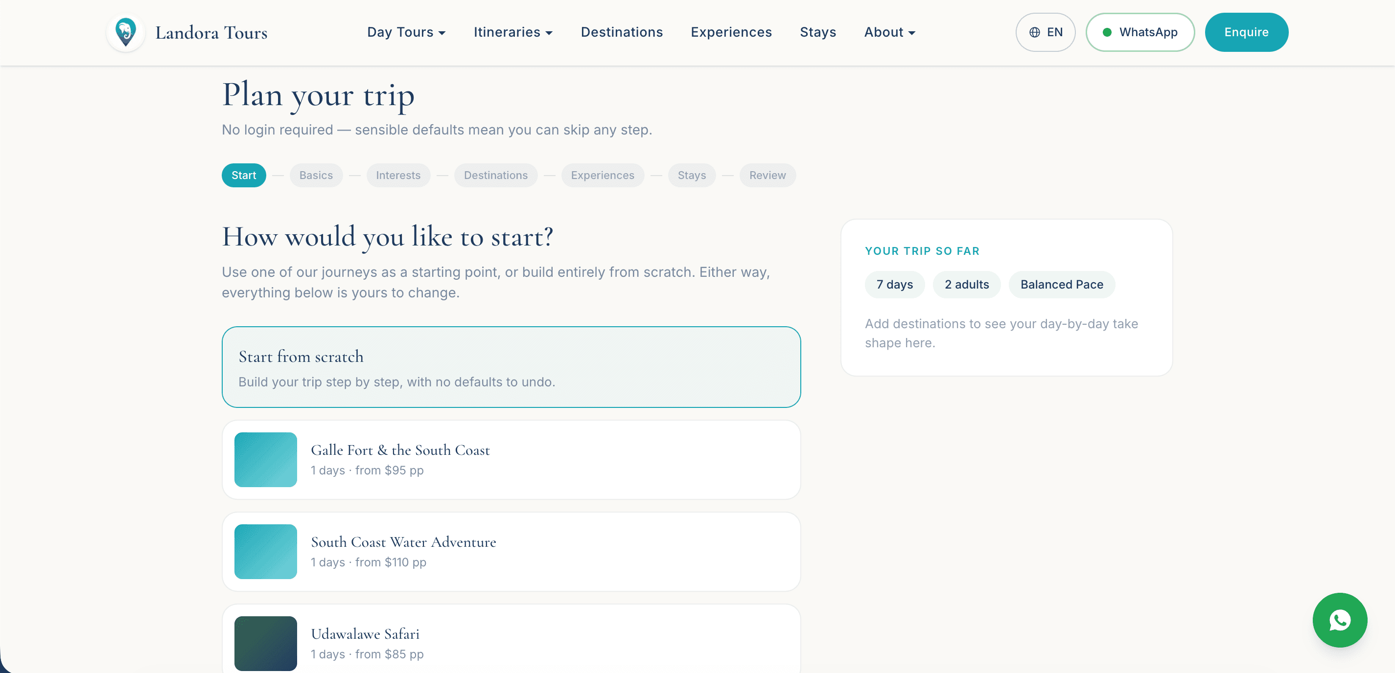
The planner walks through six steps — basics, interests, destinations, experiences, stays, review — and the traveller can start from a pre-built itinerary and change anything about it, or start from nothing at all. Sensible defaults mean any step can be skipped, and there is no login: asking someone to create an account before they have decided they like you is how you lose them.
What comes out the other end is not a booking. It is a well-formed enquiry that tells Landora exactly what this person wants before the first reply is written.
The site is mostly content, and that is the point
There are 106 pages: 17 itineraries, 30 individual experiences, 18 destination guides, 6 regions, 8 themes, stays, the team, reviews, and a journal.
That depth is not padding, it is the trust signal. An operator who can write properly about thirty experiences and eighteen places is an operator who has actually been to them. It is also, incidentally, most of the site's search surface — the traveller searching "Udawalawe safari" or "best time to visit Ella" arrives on a page that answers exactly that and happens to be run by a tour company.
The obvious build for a travel site is a booking engine: pick a date, pay, done. We did not build one, and that was deliberate.
Landora's product is a tailor-made trip. The real price moves with dates, group size, hotel tier and how much driving someone wants — which means a checkout would have forced fixed prices onto something that genuinely is not fixed. Publishing a number that is wrong for most enquiries is worse than publishing no number at all.
There is also a commercial argument. For a private tour, the conversation is where the value is added: it is where an operator upgrades a hotel, adds a day, or talks someone out of a route that will not work in monsoon season. A checkout removes that conversation in exchange for convenience the customer was not asking for.
So enquiry goes to WhatsApp, one tap from anywhere on the site. It is where this audience already is, it works across borders without a phone bill, and a reply arriving within minutes does more for trust than any payment page. The planner exists to make that first message a good one.
The trade-off is real: no revenue is captured on the site itself, and Landora carry the load of replying. For a small operator selling considered, expensive trips, that is the right shape. If the day-tour end of the catalogue ever becomes high volume, a checkout can be added to just those — the architecture does not prevent it.
Built properly underneath
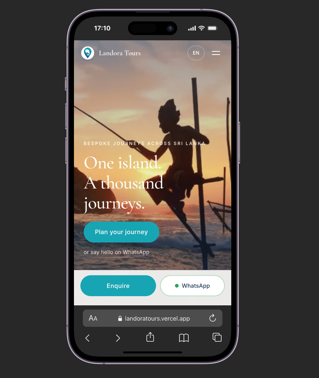
The site is Next.js on the App Router, statically generated, and deployed on Vercel. Pages are responsive from 320px up rather than "mobile-friendly" as an afterthought, which matters when a good share of the audience is browsing on a phone in an airport. We QA'd across breakpoints and devices before handover, not as a final tick-box.
What is next
Multiple languages. Landora's visitors come from Europe, Australia and Asia, and the language switcher is already in the interface — the translations are the next piece of work rather than something already shipped.
Status
Built, tested and in final review ahead of launch.